Density Diagrams
To represent and compare the different measurements of density – population density, or the average people per acre, and built density, as height, volume, and percentage of lot coverage – the Skyscraper Museum created a system of icons. These diagrams represent twelve case studies of historical housing developments featured in the exhibition.They are laid out chronologically, from top-left to bottom-right. Five are private developments: a typical tenement block, The Towers in Jackson Heights, London Terrace, Knickerbocker Village, and Manhattan House. Four are publicly-subsidized projects: Stuyvesant Town, Penn South, Silver Towers, and Co-Op City. Three are NYCHA public-housing projects: Queensbridge Houses, Taft Houses, and Polo Grounds Towers.
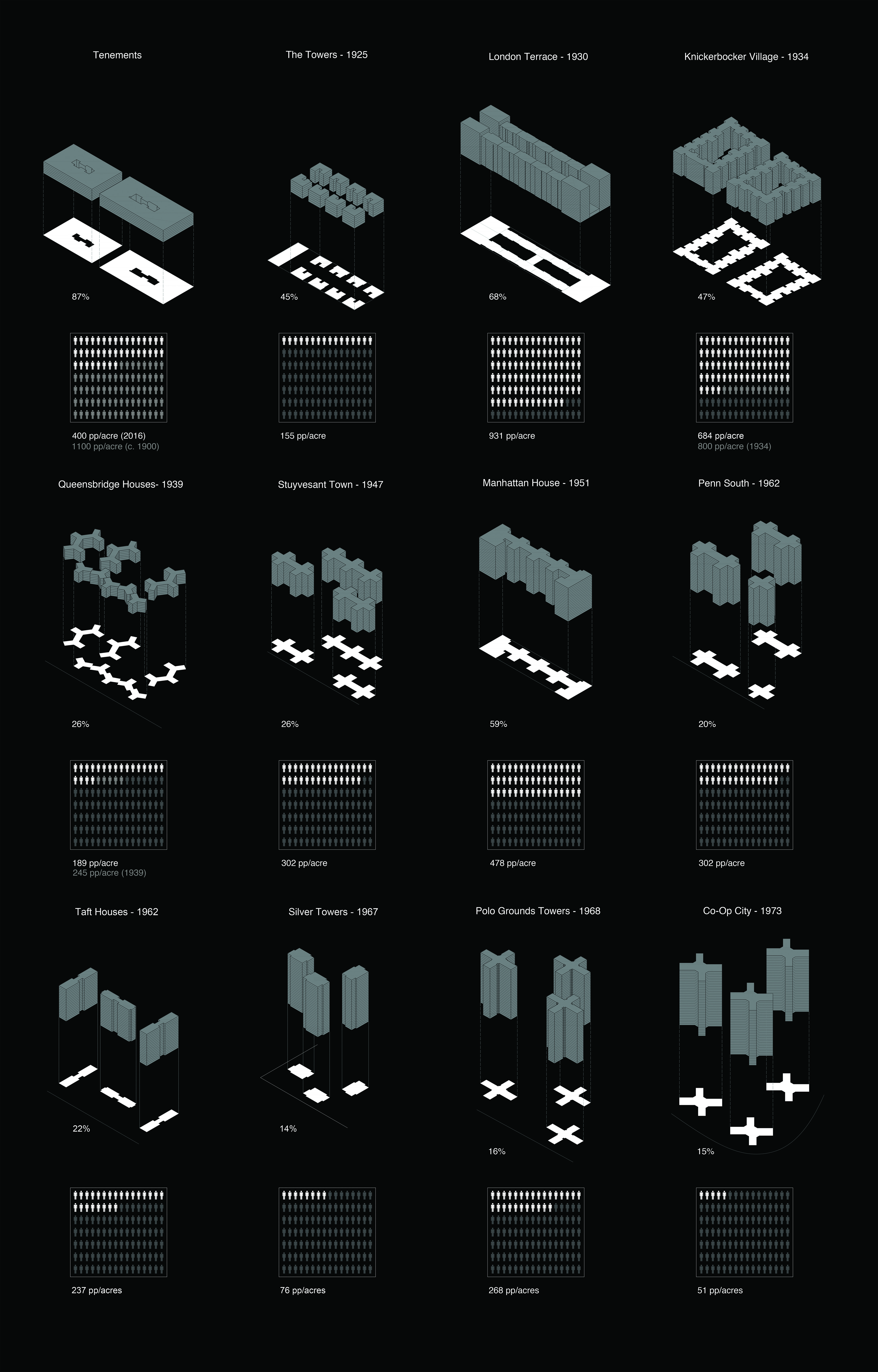
To calculate the density of a particular site, we have used its area in acres (source: OASIS NYC) and its total number of people. To obtain the latter, we have multiplied the site’s buildings unit count (source: OASIS NYC) by the average number of people/unit in the site’s borough (source: 2010 Census). In some cases, we have also included historical density figures borrowed from reports, articles, and other original sources.
The confusion between high densities and overcrowding, which I will go into briefly because it so much interferes with understanding the role of densities, is another of the obfuscations that we have inherited from Garden City planning. The Garden City planners and their disciples looked at slums which had both many dwelling units on the land (high densities) and too many people within individual dwellings (overcrowding), and failed to make any distinction between the fact of overcrowded rooms and the entirely different fact of densely built up land. They hated both equally.
– Jane Jacobs (The Death and Life of Great American Cities, p. 267)