By 1879, the date of the Taylor map on the historical slider, most of Manhattan was densely covered with masonry structures of three to six stories – the majority of which were residential, either row houses or tenements. Almost all of these buildings were built on private land as properties to rent, or sell at a profit.
As the slider shows, most neighborhood blocks changed little from the early 20th century through the 1950s, when the first urban renewal projects began to bulldoze great swaths of the city. The touch screens allow you to explore details of the individual projects and to compare their density, both of population and lot coverage.
Optimal Density?
For more than a century housing reformers have been debating and regulating “bad density.“ But what is the measure of good density? Can we put numbers on the optimal lot coverage and persons per acre that create a vital neighborhood?
In the 1960s, critics of contemporary urban renewal Jane Jacobs and Lawrence Halprin offered their answers. In Death and Life of Great American Cities in the chapter “The Need for Concentration,” Jacobs summarized her detailed analysis of the qualities of good neighborhoods to settle, reluctantly, on a number. She concluded that, with a mixture of uses and building types as a necessary part of the equation, 500 people per acre constituted optimal density.
Landscape architect Lawrence Halprin, who in 1968 authored a critique of recent urban renewal projects for the Lindsay Administration, titled New York, New York, proffered a redesign of the Penn South project that added retail and residential buildings to the site, raising the density to 500 to 600 people per acre.
What do you think is good density? The diagrams you can compare on the interface give the numbers for population and built density for the projects featured in the exhibition. But look at the models and the images around you to decide what buildings and districts seem the most appealing.
Think about how and where you’d like to live, but also consider that density is about many people. How should the city think about density so that the scarce resource of valuable urban land is best used for all its citizens?
Harlem District Model
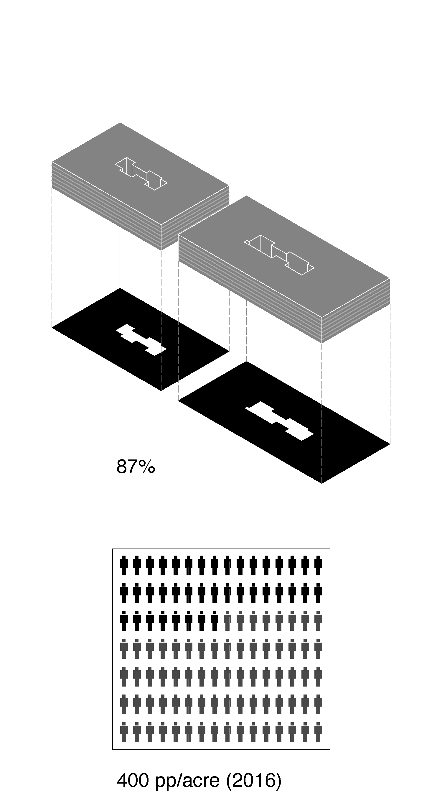
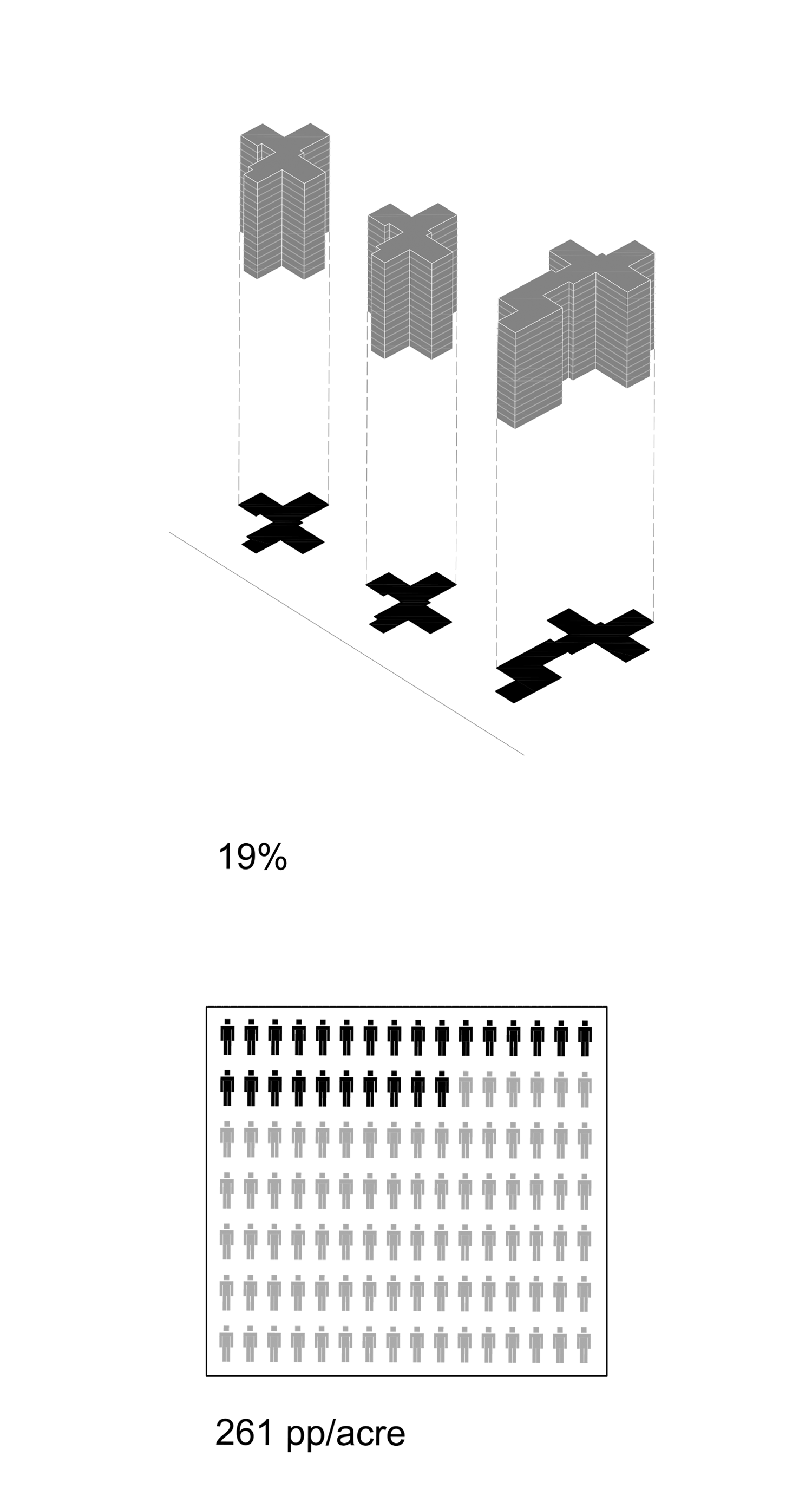
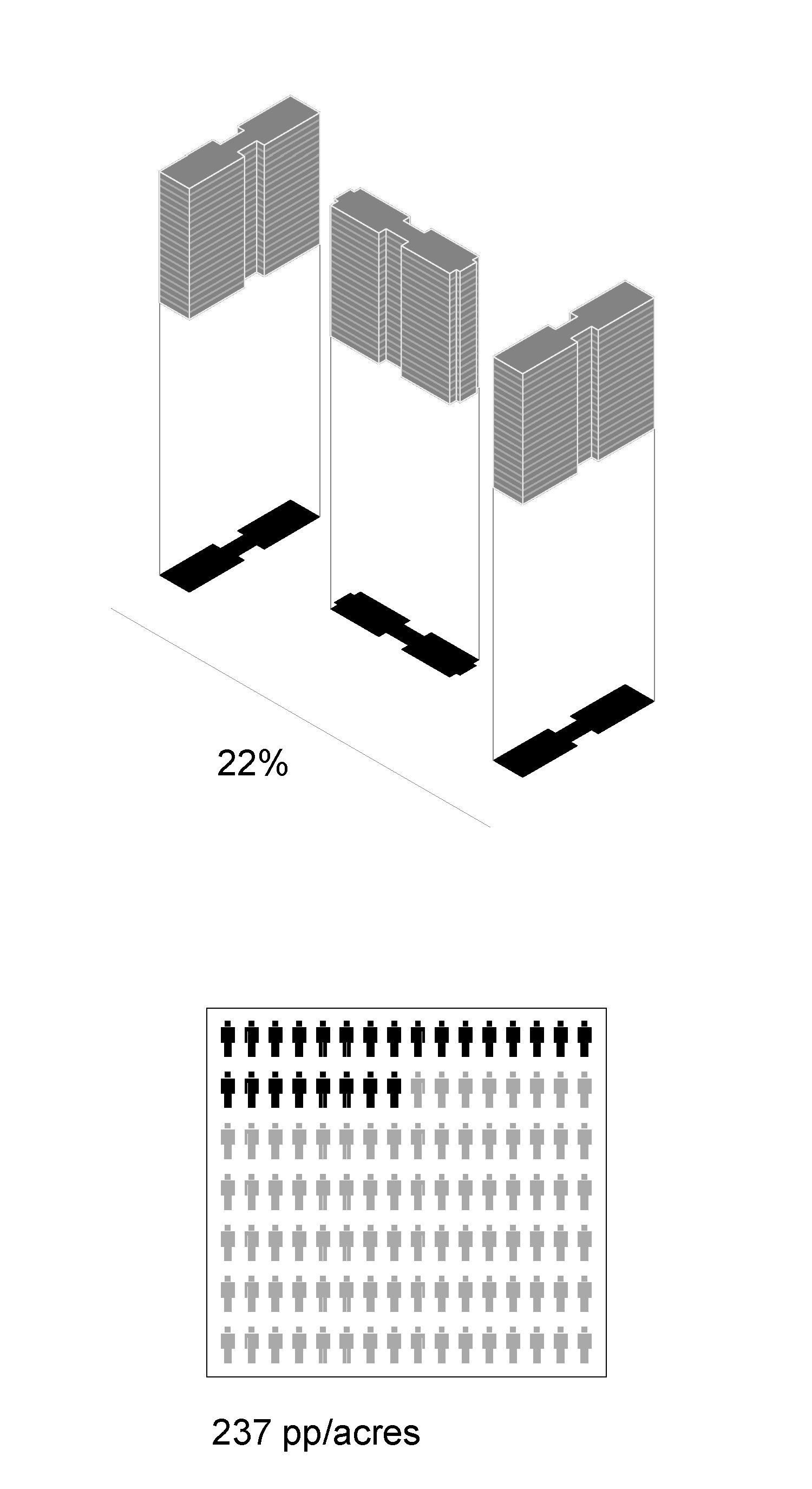
This context model, showing a portion of East Harlem, illustrates the massive reduction in built density that resulted from city officials' and NYCHA's ambitious redevelopment program that targeted Harlem since the 1940s. The grey blocks of low or medium-rise buildings are mostly tenements, townhouses, or commercial structures that once covered much of the neighborhood. By 1957, NYCHA had cleared 137 acres of compact blocks like these to make space for its towers in the park.
Highlighted in white are NYCHA projects including Johnson Houses (1948), King Towers (1954), Jefferson Houses (1959), Taft Houses (1962), and Lehman Village (1963). The transparent yellow acrylic that underlies the NYCHA projects indicates that are under-built according to current New York zoning. Indeed, the multiple variations of “tower in the park” planning range in lot coverage, or built density, from just 16 to 20 percent.
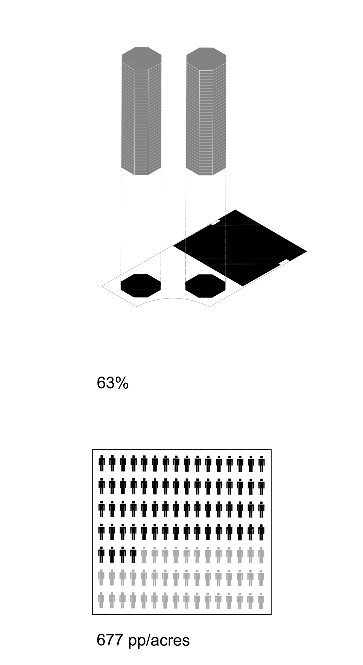
The model also includes the twin octagonal towers of Schomburg Plaza (1974), a publicly-assisted Mitchell-Lama project built by the New York State Urban Development Corporation. The UDC’s exemption from the city’s zoning laws allowed for both the innovative design and higher density of lot coverage and people per acre – 63 percent and 677 people per acre – numbers otherwise found only in private-market models such as Manhattan House. The transparent red acrylic under Schomburg Plaza indicates it is more dense than zoning would allow.